Service Cards
📍 Find this in the app: Admin Panel → Content → Page Editor (
/admin/page-editor) — add a block and pick Service Cards.
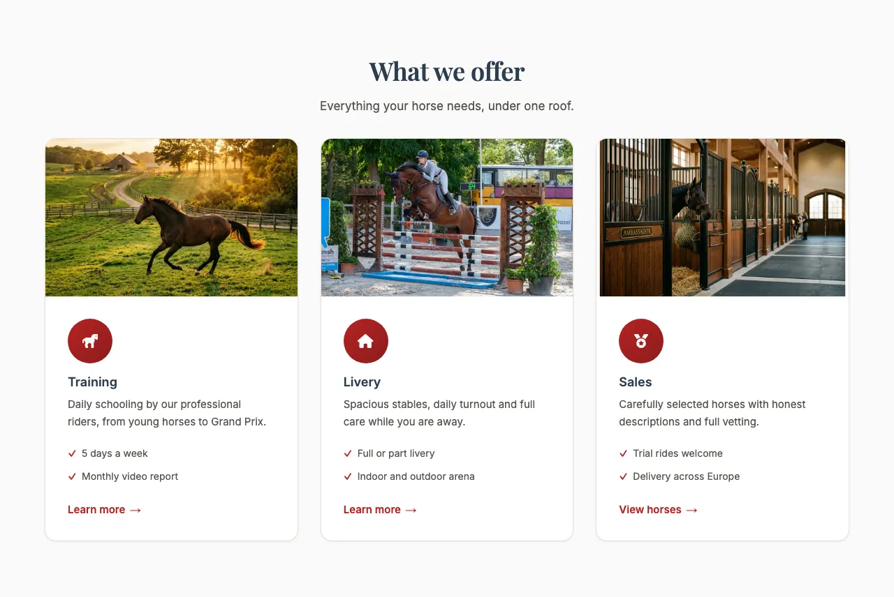
A row of cards, one per service — for example Training, Boarding and Sales — each with a short description and an optional photo and link. Visitors can see at a glance what you offer.
This is how the block looks on a stable website (example content):
Content
- Heading and Description: Optional introduction above the cards.
- Cards: Click Add card for each service, and use the bin icon to remove one. Each card has:
- Title: The name of the service.
- Description: A few lines about it. Start a line with
-to make a bullet list, or with1.for a numbered list; other lines keep their line breaks. - Image (optional): A photo for the card. Upload it or paste a link.
- Link URL (optional) and Link text (optional): Turns the card into a link, for example "Learn more" to
/training. The link only appears when both are filled in.
Settings
- Number of columns: How many cards sit next to each other on a computer screen: 2, 3 or 4. On phones the cards are always stacked.
- Card style:
- Default: Plain cards with a light shadow.
- Bordered (accent top border): Flat cards with a coloured line along the top.
- Horizontal (icon left): Wide cards with the icon on the left and the text on the right.
- Icon hero (large icon top): A large icon at the top of each card, with the text centred below it.
- Image top (photo header): The card's photo across the top, with the text underneath.
- Image framing: Show top, Centre or Show bottom — which part of each card's photo stays in view when it's cropped.
- Show feature list: Shows the list of features under each card's description.
- Show icons: Shows the small icon on each card.
note
Icons and feature lists come with the ready-made cards of your starting template and can't be edited in the Page Editor yet. Cards you add yourself show only title, description, photo and link. To show a list on those cards, start lines in the Description with -.